Our Analysis Process

We use a comprehensive, data-driven approach to analyze name rarity

1Data Collection

We gather comprehensive name data from official government records, spanning 114 years of historical records from 1910 to the present day. This includes millions of birth records across different regions.

2Statistical Analysis

Our algorithms analyze naming patterns, frequency distributions, and historical trends to calculate precise rarity scores. We consider both absolute numbers and relative popularity over time.

3Insight Generation

We transform raw data into meaningful insights about your name's uniqueness, historical significance, and popularity trends. This includes peak periods, regional variations, and cultural context.

Our Data Sources

We use multiple reliable sources to ensure the accuracy and comprehensiveness of our name analysis:

Official Birth Records

We analyze official government birth registration data from multiple countries, providing accurate name frequency information over decades.

International Databases

Our system incorporates international naming databases to provide global context and cross-cultural insights about name usage patterns.

Historical Archives

We reference historical archives and census records to extend our analysis further back in time and provide deeper historical context.

Historical Coverage

Our database spans over a century of naming trends, allowing us to track how name popularity has evolved over time:

1910s-1930s

Early Records

Initial systematic collection of birth name records, establishing baseline popularity metrics.

1940s-1960s

Mid-Century Data

Post-war naming trends and the emergence of new cultural influences on naming practices.

1970s-1990s

Modern Expansion

Comprehensive digital records and expanded demographic tracking across regions.

2000s-Present

Contemporary Analysis

Real-time data collection and advanced analytics for current naming trends and predictions.

Our Methodology

We use a multi-faceted approach to determine name rarity that goes beyond simple counting:

  • Frequency Analysis: We calculate how often a name appears relative to the total population over time.
  • Historical Trending: We track how a name's popularity has risen or fallen across different decades.
  • Regional Distribution: We analyze geographic variations in name usage to identify regional preferences.
  • Generational Context: We provide insights into which generations most commonly used specific names.
  • Cultural Significance: We incorporate cultural and historical context that may have influenced naming trends. Try Now.
Name Analysis Methodology

Understanding Your Results

A comprehensive guide to interpreting your name analysis

Your Name at a Glance

At the top of your results, you'll see key stats and badges that instantly tell you about your name:

The Badges

  • Gender badges (like "Primarily Female") show which gender your name is most commonly used for
  • Commonality badge (like "Common") gives you the quick verdict on rarity
  • "Since 1910" means your name has been in records since tracking began

Lucky Number

That colored circle with a number? It's your name's lucky number from 1-9, calculated using numerology. We assign each letter a value (A=1, B=2, and so on), add them together, and reduce it to a single digit. Think of it as your name's personal number. Your Complete Guide to Numerology.

The Four Main Stats

  • Overall Rank (#85) – Where your name stands in popularity among ALL names. Lower numbers mean more popular. If you're #85, exactly 84 names are more common than yours.
  • Total Count (683.4k) – How many real people have been given your name since 1910. This is actual people, not percentages or estimates.
  • Percentile Score (99.75%) – This tells you that your name is more popular than 99.75% of all other names. Higher percentile = more common name.
  • Since Year (1910) – The first year your name appeared in official records. Older dates mean your name has a longer history.

Understanding the Rarity Analysis

Right below the main stats, you'll see a colored banner with a statement like:

"EMMA is common, with 1 in 480 people having this name"

This translates your data into real-world terms. It means if you randomly selected 480 people in America, statistically one of them would share your name. Lower numbers (like 1 in 100) mean very common names. Higher numbers (like 1 in 50,000) mean rare names.

The Three Key Gauges

  • Popularity Score (Green Gauge)
    Shows a percentage (like 99.8%) with a green meter. This tells you how popular your name is compared to all other names. The higher the percentage and the more green fills the gauge, the more common your name is.
    What to look for: Above 90% = very common, 50-90% = moderately common, below 50% = less common
  • Rarity Score (Gray Gauge)
    The opposite of popularity—it shows how unique your name is. A low percentage (like 0.3%) means your name is not rare. A high percentage means it's distinctive.
    What to look for: This is simply 100 minus your popularity score
  • Gender Distribution (Large Donut Chart)
    This colorful ring chart shows the male-to-female split for your name.
    How to read it: If it's mostly pink/red, your name is predominantly female. If it's mostly blue, it's predominantly male. An even split means it's truly gender-neutral. Now, Find out how rare your name is!

Your Name's Journey: The Graphs

Popularity Trend (Blue Line Graph)

This shows your name's popularity year by year from 1910 to today.

What to look for:

  • Sharp peaks = your name had a huge moment (often tied to celebrities, movies, or cultural events)
  • Steady lines = consistent popularity across decades
  • Valleys = periods when your name fell out of favor
  • Recent rises = your name is making a comeback

Below the graph, you'll see text like "The name EMMA was most popular in 2003 with 22,726 births." This is your name's peak moment in history.

Decade Breakdown (Purple Bar Chart)

Shows your name's popularity in each decade as bars.

How to read it:

  • Taller bars = more popular in that decade
  • We show births per 10,000, so you can fairly compare different time periods
  • The text below tells you which decade was your name's golden era

For example: "The name EMMA had the highest average births 19,504 per year in the 2010s."

Detailed Comparisons

Rarity Gauge (Colored Semi-Circle)

This speedometer-style gauge shows your rarity score visually. The needle points to your score, and the colors shift from orange (common) to green (middle) to gray (rare).

What the number means:

  • 0-30 = Very common name
  • 30-60 = Moderately common
  • 60-80 = Somewhat rare
  • 80-100 = Very rare

Ranking Comparison (Three Bars)

Shows three bars: Overall, Male, and Female rankings.

What this reveals:

  • If your Male bar is much taller than Female, it means your name ranks much higher (less popular) among males
  • If Female is shorter, your name is more popular as a female name
  • The text below spells it out: "Overall ranking 49.9K, Male ranking 19.7K, Female ranking 25.0K"

Higher numbers = less popular in that category.

Generation & Time Period Analysis

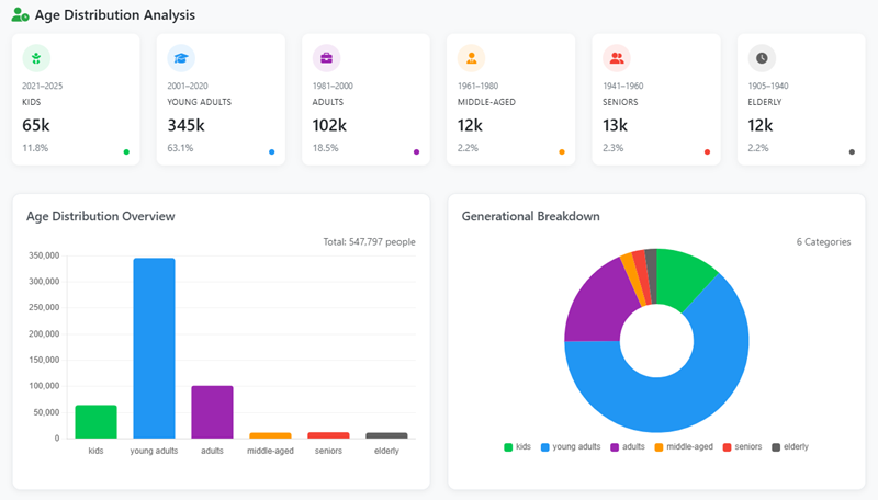
Generational Breakdown (Colorful Pie Chart)

This wheel shows which generations have your name most.

The slices represent:

  • Gen Alpha (born 2013+)
  • Gen Z (born 1997-2012)
  • Millennials (born 1981-1996)
  • Gen X (born 1965-1980)
  • Boomers (born 1946-1964)
  • Silent Gen (born 1928-1945)

How to read it: The biggest slice tells you which age group you'll find the most people with your name. Text below confirms it: "The name EMMA was most popular among Gen Z with 268,596 births (44.5%)."

Multi-Metric Analysis (Purple Radar Chart)

This pentagon/diamond shape plots five different measurements of your name at once:

  1. Popularity (top point) – How common it is overall
  2. Percentile (right) – Your ranking percentage
  3. Frequency (bottom right) – How often it's used
  4. Rarity (bottom left) – How unique it is
  5. Historical Age (left) – How long it's been around

How to read it: The further out the purple area extends toward any point, the higher your name scores in that category. A balanced shape means your name is moderate across all measures. A shape heavily weighted to one side shows what makes your name distinctive.

Your Name's Personality

Psychometric Profile (Horizontal Bars)

Six colored bars show personality traits associated with your name:

  • Confidence (yellow)
  • Creativity (yellow)
  • Stability (yellow)
  • Ambition (green)
  • Empathy (yellow)
  • Logic (yellow)

How to read it: Each percentage shows how strongly your name is associated with that trait. Higher percentages and longer bars mean stronger associations. The text below highlights your strongest trait: "Your psychometric profile shows you're strongest in ambition" (92% in this example).

What this means: We analyze your name's letters, historical patterns, cultural associations, and phonetic qualities to create this profile. It's based on real naming trends, though it's more for interest than scientific prediction.

This profile draws inspiration from the study of core personality traits, often explored in major psychological frameworks like the Big Five personality traits.

What Your Results Mean

Every chart and number tells part of your name's story:

  • High percentile + big total count = You share your name with many others; it's a popular choice
  • Low percentile + small total count = Your name is distinctive and rare
  • Old "Since Year" = Your name has historical staying power
  • Recent peak in trend graph = Your name is currently trendy or recently became popular
  • Lopsided gender chart = Your name is strongly associated with one gender
  • Large Gen Z slice = Your name is especially popular among younger people today

Together, these elements paint a complete picture of your name's journey through American history and where it stands today.

Accuracy You Can Trust

Every number on your results page comes directly from official Social Security Administration and official government birth records. When we say 683,400 people have your name, that's verified government data, not an estimate.

As new data is added each year, rankings and trends may shift. A rare name today could become tomorrow's trend, or a popular name might gradually become more unique. That's the beauty of names—they're living parts of our culture that evolve with us.

Ready to Discover Your Name's Rarity?

Find out how unique your name is with our comprehensive analysis

Check Your Name Now